Dear Orange Mali,
I use MaxIt every day. I buy mobile data, send money and pay the shopkeeper down the street. Like so many people in Mali.
For readers outside Mali: MaxIt is Orange Mali's all-in-one app. It brings together Orange Money, the mobile wallet many Malians rely on every day, along with data and airtime top-ups, bill payments and even online shopping.
The first time I opened this version of the app, I was lost. I knew what I wanted to do, just not where to go.
MaxIt does almost everything: money, data plans, bills, even online shopping. It's ambitious. But the more an app does, the harder it gets to find the few things you do every day. You noticed this before I did: there is already a "Simple mode".
So I asked myself: what if Simple mode were the front door of the app? At Nivel, we set out to answer that question.
What people come to do
When someone opens the app, it is almost always for one of these five things:
- Buy mobile data
- Send money
- Top up airtime
- Pay a merchant
- Pay a bill
We put these five actions up front. Everything else is still there, filed in one place under a clear name. The whole app fits into four tabs: Home, Money, Plans and More.
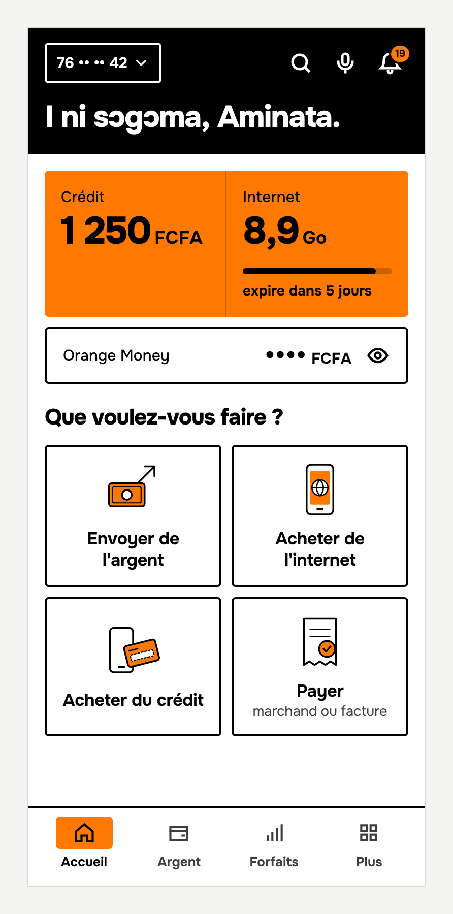
On the home screen, people want to know how much they have left, then get on with what they came to do. At the top: airtime, data and the Orange Money balance. For data, a single number, rounded down, never up. The exact figure is one tap away. Data prices are a sensitive topic in Mali, so the number on screen should be simple and honest.
Below that: four large buttons, and no advertising. Offers have their place elsewhere in the app.
In the morning, the app says "I ni sɔgɔma", good morning in Bambara, the most widely spoken language in Mali. Everything else stays in French, because French is the language people learn to read in at school here. But everyone understands a good morning in Bambara.
Three areas of work
Hierarchy
On every screen, one thing should catch the eye first.
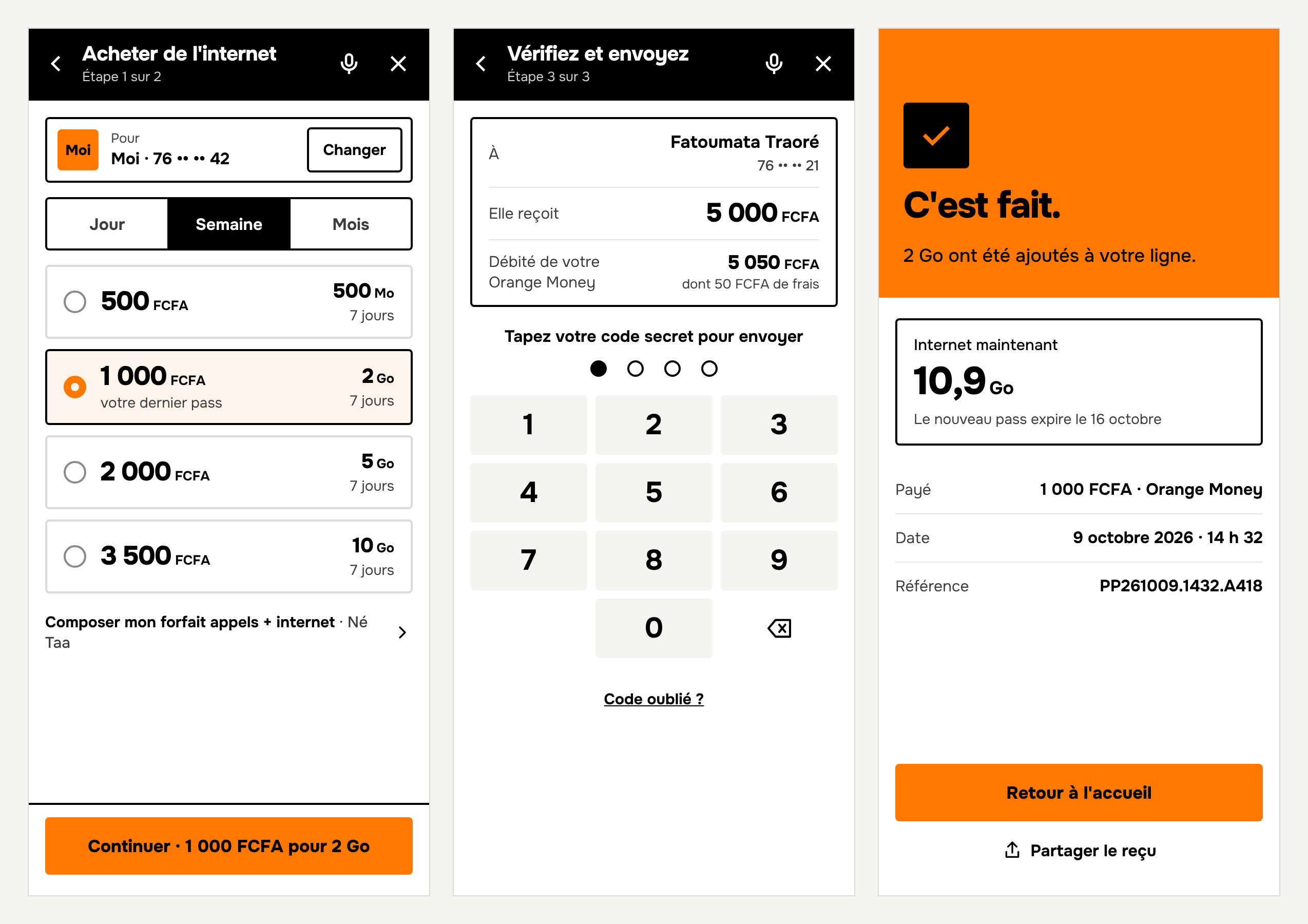
Take buying data. In Mali, people buy with a budget in mind: 500 or 1,000 FCFA, roughly €0.75 or €1.50. You often hear that "1,000 francs doesn't last". So on our screen, the price is large, and right next to it you see what it gets you: the amount of data and how long it lasts. Your last bundle is already selected, because people tend to buy the same one again. After the purchase, the confirmation screen shows how much data you now have, and until when.
Numbers are large, units smaller, and always written the same way: FCFA.
Navigation
Every service lives in exactly one place. During a purchase, the bottom bar disappears. At the top, the screen shows the step ("Step 1 of 2") and a button lets you leave at any time.
The app already shows a summary before you pay, and that is a good thing. We kept it to three lines: to whom, how much, and the total debited, fees and tax included. The difference is that you enter your PIN on that same screen, with the digits laid out like a regular phone keypad. The amount is right in front of you when you confirm.
Consistency
Every icon shares the same thin stroke and a single touch of orange. Orange's own orange and black, flat colors, slightly rounded corners. One typeface, Onest, chosen partly because it makes numbers stand out and supports the characters of written Bambara (ɔ, ɛ, ɲ, ŋ). When every screen looks like the one before, you stop searching, and the app ends up with a personality of its own.
What we kept
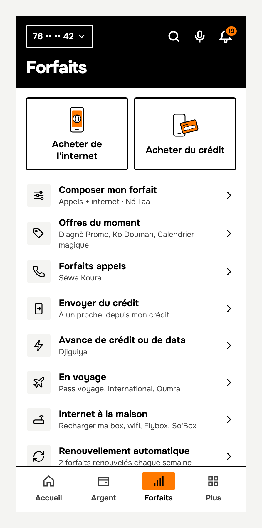
Orange has strong brands, and we gave them more visibility, not less. They now sit under an action everyone understands: "Build my plan", with Né Taa underneath. Né Taa means "mine" in Bambara, and that is exactly the idea: a plan where you choose your own mix of calls and data. Someone who doesn't know the name still finds it. Same for savings: "Put money aside", with Wari Mara underneath.
And where does AI fit in?
We did this work with the help of AI. It let us draw screens much faster and try dozens of variations. The decisions, though, come from using the app every day.
MaxIt is already in our pockets. We would just like to find our way around it faster.